Learning Module Panels
Modules are made up of Course pages. Panels are components of these pages and are designed to make the development of advanced content easy for developers without web development skills. The image below shows a page which is made up of 2 types of panels, on the left is a Plain Text panel and on the right is an Image panel. In the image panel the system has rounded the corners of the image and also sized it accordingly.
There are 2 categories of panel types, learning panels and quiz panels.

To learn about creating modules, adding pages to a module and panels to a page please see our document on Modules.
Plain Text
The Plain Text panel is used to add text to a page. The Plain Text panel has an editor with standard editing functionality.
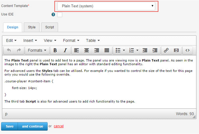
For advanced users the Styles tab can be utilised. For example if you wanted to control the size of the text for this page only you would use the following override.
.course-player #content-item {
font-size: 14px;
}
The third tab Script is also for advanced users to add rich functionality to the page.
Reveal List
Reveal lists are lines of text that are hidden by blurring the words when the page is first opened. The learner has to click a button to reveal the text line by line. The screenshot below is of a reveal list on a page. Although it is called a reveal list it does not have bullets or numbers as a list does.

To add a Reveal list to the page:
- Add a Plain Text (system) panel on your page.
- Create a Bullet List using the editor
 .
. - In the editor enter Source code mode by clicking the
 icon as shown in the screenshot below.

The first line of your list will have a ul tag <ul>. The letters ul are html code for unordered list.
Add Class= “reveal” to the ul tag, for example.
Note: When you add this Reveal code, the list no longer has bullets or numbers. You will need to manually add the numbers or bullets if required.
This is the code for a regular list: <ul> <li> First line of the list </li> <li> Second line of the list </li> <li> Third line of the list </li> </ul> | This is the code for a Reveal list: <ul class=”reveal”> <li> First line of the list </li> <li> Second line of the list </li> <li> Third line of the list </li> </ul> |
Pop-up
A pop-up provides an interactive means for opening relevant text in separate dialogue box. This is an example of a pop-up:
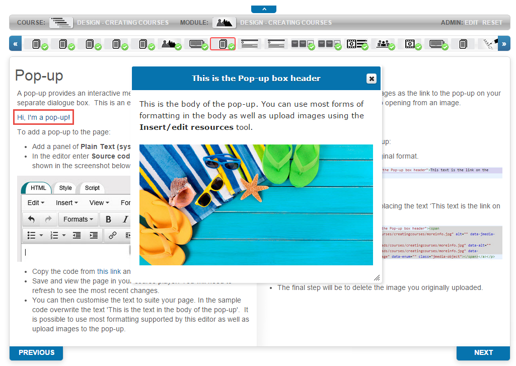
To add a pop-up to the page:
Add a panel of Plain Text (system) type.
In the editor enter Source code mode by clicking the icon as shown in the screenshot below.
- Copy the code from below and paste it into the source code window.
<p><a class=”popup” href=”#mypopup0″ title=”This text is the Pop-up box header”>This text is the link on the page</a></p> <div class=”popup” id=”mypopup0″> <p>This is the text in the body of the pop-up</p> </div> |
- Save and view the page in your course player. You will need to refresh to see the most recent changes.
- You can then customise the text to suite your page. In the sample code overwrite the text ‘This is the text in the body of the pop-up’.
Note: It is possible to use most formatting supported by this editor as well as upload images to the pop-up.
Introduction
The Introduction Text panel type features animated text that slides in from the left hand side of the screen.
The text comes from the title and description of the Module that the Page belongs to.
This sentence is also added: “Please use the thumbnails above or the next and previous buttons below to navigate through the module”.

Note: do not enter text into the panel itself, because this will not be displayed.
Accordion
Similar to Tabbed Content, the Accordion panel allows several windows to be stacked on each other. All except one of them are minimised or shaded so only their captions are visible. If one of them is clicked, it becomes active and is unshaded or maximized. Only one window is available at a time to reduce information overload. It reduces the size of a page which makes it viewable on compact screens such as tablets with minimal scrolling. Below is an example of an Accordion.

To add an Accordion to the page:
- Add a panel of Accordion type.
- In the editor enter Source code mode by clicking the icon as shown in the screenshot below.
- Copy the code below and past it into the source code window.
- Save and view the page in your course player. You will need to refresh to see the most recent changes.
- You can then customise the text to suit your page.
<h3><a shape=”rect”>This is the first heading</a></h3> <div> <p>This is the text for the first page</p> </div> <h3><a shape=”rect”>This is the second heading</a></h3> <div> <p>This is the text for the second page</p> </div> <h3><a shape=”rect”>This is the third heading</a></h3> <div> <p>This is the text for the third page</p> </div> <h3><a shape=”rect”>This is the fourth heading</a></h3> <div> <p>This is the text for the fourth page</p> </div> |
Tabbed Content
Similar to the Accordion, Tabbed Content allows several windows to be stacked next to each other. Only one tab is available at a time to reduce information overload. It reduces the size of a page which makes it viewable on compact screens such as tablets with minimal scrolling. Below is an example of Tabbed Content.
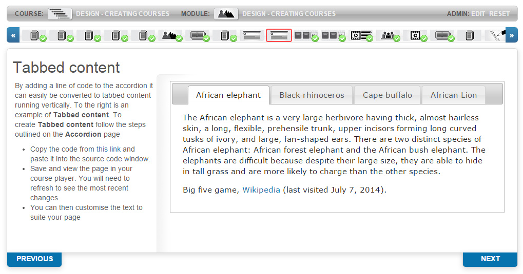
To add Tabbed Content to the page:
- Add a panel of Accordion type.
- In the editor enter Source code mode by clicking the
 icon as shown in the screenshot below.

- Copy the code below and past it into the source code window.
- Save and view the page in your course player. You will need to refresh to see the most recent changes.
- You can then customise the text to suite your page.
This is an example of Tabbed Content.
<div class=”accordion-panel-options” style=”display: none;” data-layout=”top” data-completion=”0″ data-header=”h3″ data-overflow-ellipsis=”false”></div> |
Reflection Tiles
The Reflection Tiles panel allows you to create tiles that flip over when selected. They can display text or images. The number of tiles as well as the height and width of the tiles can be changed. The colour of the tiles is inherited from the site theme.

To add Reflection Tiles to the page:
- Add a panel of Reflection Tiles type.
- In the editor enter Source code mode by clicking the icon as shown in the screenshot below.
- Copy the code below and past it into the source code window.
- Save and view the page in your course player. You will need to refresh to see the most recent changes.
- You can then customise the text to suite your page.
<blockquote>column=3;width=204;height=360</blockquote> <h2>Front of reflection tile one</h2> <p>Back of reflection tile one</p> <h2>Front of reflection tile two</h2> <p>Back of reflection tile two</p> <h2>Front of reflection tile three</h2> <p>Back of reflection tile three</p> |
It is possible to adjust the size and number of the tiles as well as add images to the front of the tile.
Once you have pasted the supplied code into the panel you will notice the top line “column=3;width=204;height=360”
Column controls the number of tiles
Width controls the width of the tile
Height controls the height of the tile
To add an image highlight the text and use the Insert/edit resource  tool in the editor to replace the text with an image. The size of the image will need to be slightly smaller than the tile to account for padding.
In this example the following configurations have been made: “column=3;width=200;height=200” . If you added images they would need to be sized at around 195px x 195px.
If the number of tiles exceed the width of the panel they will automatically wrap to the next line.
Slideshow
The Slideshow panel is interactive way to display multiple images in an organised and compact manner. When the code supplied below is pasted into the editor a table will be visible with rows and columns. The code is over 1000 lines long but most of it does not require configuration. The main columns of relevance are the Image and Overlay columns.
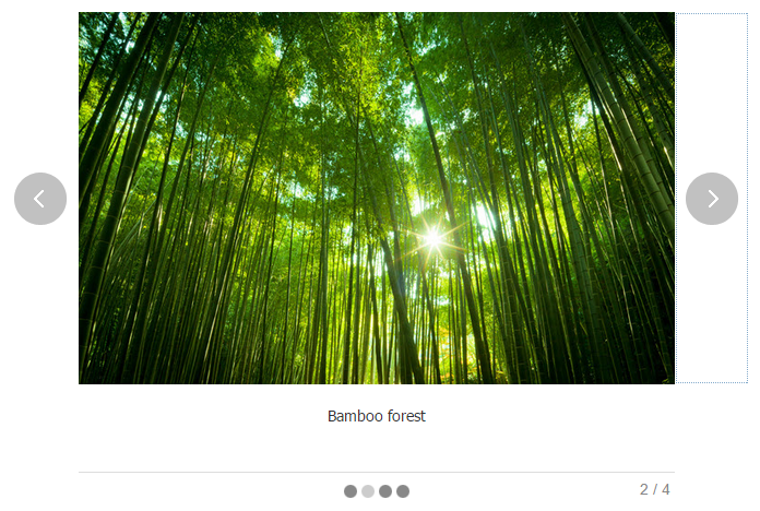
Images are added to the slideshow in the image column using the Resource Editor .
- To add text to a slide type into the overlay column to the right of the image.
- To add audio to a slide use the resource editor to upload an mp3 to the audio column.
Automatic transition Speed in the auto-running slideshow can be set. In edit mode do a search (ctrl + f) for timeout in the Name column. A custom value of 0 prevents automatic slide transition. When this value is increased to 4000 slides transitions every 4000 milliseconds.
- Add a panel of Slideshow type.
- In the editor enter Source code mode by clicking the icon as shown in the screenshot below.
- Copy the code from this file and past it into the source code window.
- Save and view the page in your course player. You will need to refresh to see the most recent changes.
- You can then make the required customisations to your slideshow.
Hotspot
A hotspot is an image with coordinates set which create several active regions. Each active region becomes a pop-up with text relating to the region. In this example 4 hotspots have been set, one for each type of flower.

Finding the coordinates can be calculated for simple images such as the one above. The coordinates of the top-left corner of an area are 0,0. The size of the image is 400x400px. Each flower inset is 200x200px. The coordinates of the sunflower are therefore “0,0,200,200”. 0,0 are the coordinates of the top left corner and 200,200 the bottom right corner. The Fuchsia is “200,200,400,400”.
For more complicated images any image editor such a Paint can be used to find the coordinates usually by hovering in the required area.
To add this hotspot to the page:
- Add a panel of Hotspot type.
- Upload the image using the Resource Editor .
It is important to populate the Description and Text Alternate fields with the text map=hotspotmap
- Once you have added the image press the enter key to move the cursor to the line after the image.
- In the editor enter the Source code mode by clicking the icon.
- Copy the code from below and paste it into the source code window after thetags.
- Save and view the page in your course player. You will need to refresh to see the most recent changes.
- You can then customise the text, coordinates and image to suit your page.
<map id=”hotspotmap” name=”hotspotmap”> <area shape=”rect” coords=”0,0,200,200″ href=”#” /> <area shape=”rect” coords=”200,0,400,200″ href=”#” /> <area shape=”rect” coords=”0,200,200,400″ href=”#” /> <area shape=”rect” coords=”200,200,400,400″ href=”#” /> </map> <h2>First hotspot</h2> <p>First hotspot popup text</p> <h2>second hotspot</h2> <p>second hotspot popup text</p> <h2>third hotspot</h2> <p>third hotspot popup text</p> <h2>fourth hotspot</h2> <p>fourth hotspot popup text</p> |
Video
The video panel is designed to easily embed a video into the page without any code required. The recommended file type is mp4. Other supported formats are m4v, f4v, mov.

To add a video:
- Add a panel of Video type.
- Upload a video using the button Select video.
- Upload captions using the Select captions button. Captions are optional. The supported file types are ‘srt, ‘vtt, ttml and dfxp.
- Select an image using the Select image button. Before the video is played a black screen will appear. If this option is used the uploaded image will appear instead.
- Edit metadata provides options to add Text Alternative, video size and Captions.
If you’re finding that your video takes a long time to load on your site, then you can always use YouTube. YouTube is the video platform leader and is fast, free and easy. It automatically manages aspects of the video such as compression and sizing. If this method is preferred copy and paste the YouTube provided embed code into the Source code of Plain Text panel.
You will find YouTube Embed code under Share link.

SCORM
The SCORM panel is used to display simple SCORM courses within the course player. This panel should be used for simple SCORM courses designed to enhance the learning aspects of a Janison course. The SCORM courses placed into a panel should be kept simple and not be concerned with storing progress within tests or questions. You will need to create a SCORM course in a third party application such as Articulate.

To apply a SCORM to a course panel:
- Enter a Title for the Panel.
- Select SCORM from the Content Template option.
- Select your desired SCORM course from the SCORM Course option.
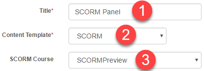
You will need to create a SCORM course beforehand to link it to a Course Panel.
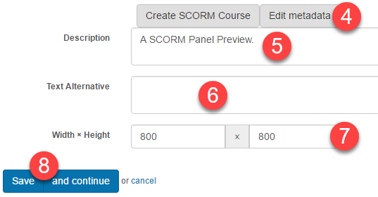
- Select Edit metadata.
- Enter an optional Description for the SCORM course.
- Enter optional Text Alternative.
- Optionally, Enter a new Width and Height for the SCORM course within the Panel.
- Select Save.
Module Progress
The module completion script calculates a user’s progress in the module. When a user reaches this page a notification will appear advising the user if they have or have not completed. The text can be customised by editing the text.
To add completion scripts to the page:
- Add a panel of Plain Text type.
- In the editor enter Source code mode by clicking the Source code icon as shown in the screenshot below.
- Copy the code below and past it into the source code window.
- Save and view the page in your course player. You will need to refresh to see the most recent changes.
- You can then customise the text to suite your page.
Examples of text that can be entered into this page:
Completion text:
Well done, you have completed this topic.
When you select Next you will be taken to the module homepage where you can access the next topic.
Not yet completed text:
Although you have reached the end of the topic, one or more pages still need to be completed.
Review the topic menu bar and check that each of the thumbnails has a green tick. Where a thumbnail does not have a tick, revisit that task and follow any instructions.