Test player themes
A test player theme changes how the test player looks. It can carry a logo and a colour for each part of the player. Anyone comfortable with CSS can add a stylesheet that overrides the player's own. The player applies the theme wherever a test is delivered, in a browser or inside Janison Replay.
A test gets its theme from the first of these that applies:
- a theme on one of the test-taker's personal needs and preferences (PNP) codes
- the theme chosen on the test itself
- the tenant's default theme, for any test with no theme of its own.
With none of the three, the player uses its built-in colours.
Create a theme
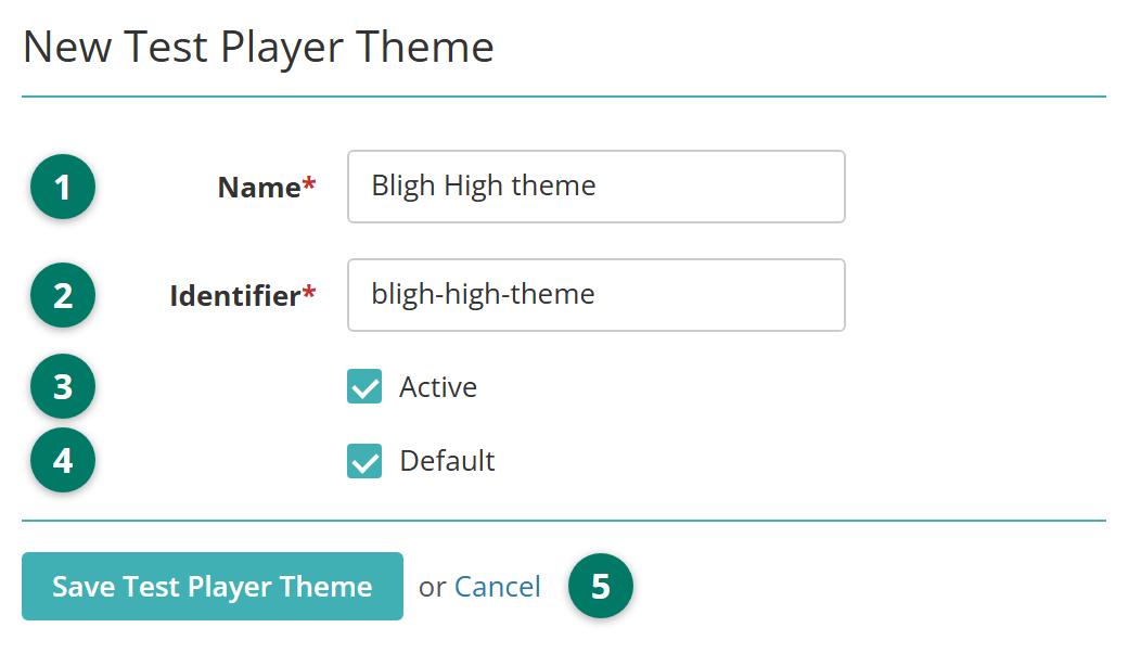
Go to Author > Test Player Themes and select Add Test Player Theme. The list behind the button has Active and Inactive tabs and a search box that matches a theme's name or identifier.
- Enter a Name for the theme.
- Check the Identifier. It fills in from the name, and you can change it. Use letters, digits, hyphens and underscores only.
- Leave Active ticked so the theme can be chosen for tests. Untick it to withdraw a theme without deleting it.
- Tick Default to apply the theme to every test that has no theme of its own. A tenant has one default theme: ticking it here clears it on the previous default, and it only works while the theme is also active.
- Select Save Test Player Theme.
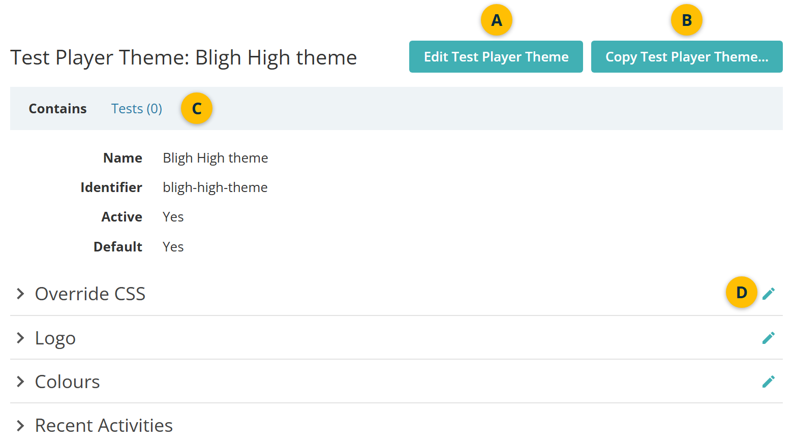
The theme's details page opens. Its three sections start empty, so the theme looks like the built-in player until you fill them in.
- Edit Test Player Theme changes the name, identifier, Active and Default. The edit form also holds Delete, which isn't offered for the default theme.
- Copy Test Player Theme... starts a new theme with this one's CSS, colours, logo and Show Everywhere setting, named "Bligh High theme - Copy".
- Tests counts the tests using the theme and links to their list.
- The pencil icon opens a section for editing. Each section saves on its own.
Override CSS
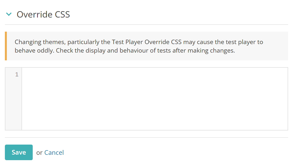
If your role allows it, you can add CSS that overrides the player's own styles. Select the pencil icon  beside Override CSS, enter the CSS and select Save.
Warning
Override CSS can make the test player behave oddly. Check the display and behaviour of a test that uses the theme before test-takers sit it.
Logo
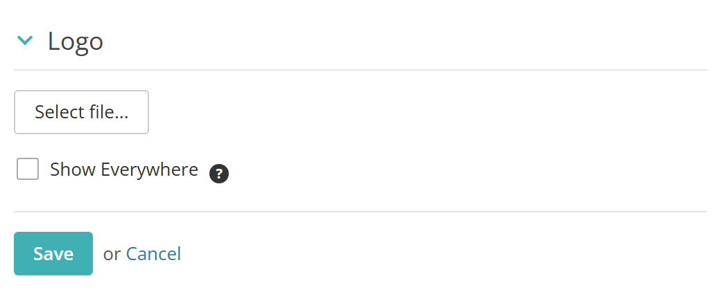
Select the pencil icon beside Logo, choose an image file with Select file... and select Save. Only image files are accepted.
The logo shows on the player's information pages, such as the start and finish pages, and stays off the item pages to leave room for the items. Tick Show Everywhere to show it on every page.
Colours
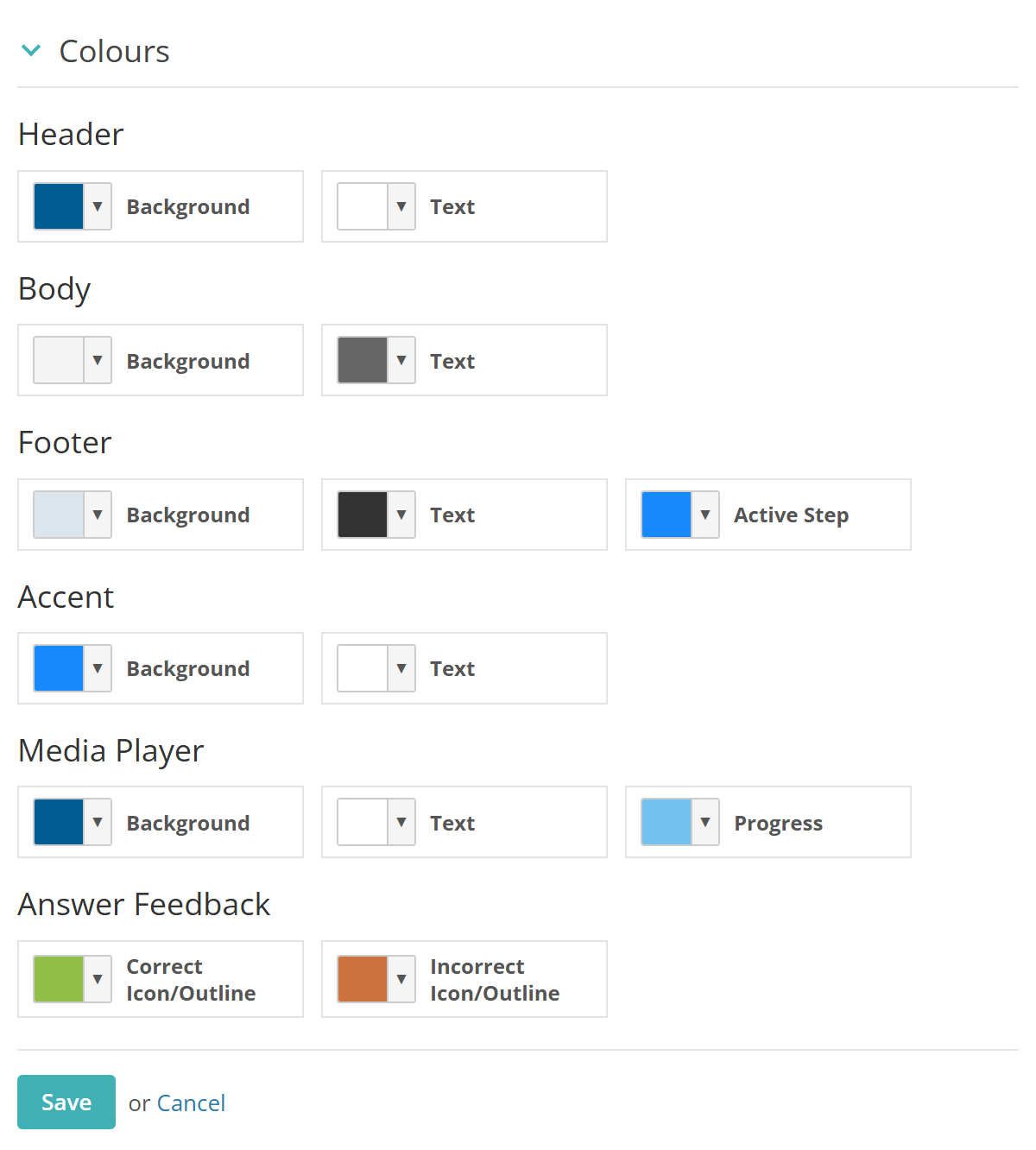
Select the pencil icon beside Colours, pick a colour for each part of the player and select Save. The groups are:
- Header: the bar across the top, with the timer and item count.
- Body: the area the items appear in, and its text.
- Footer: the bar across the bottom, with the navigation buttons. Active Step marks the current step where the footer shows one.
- Accent: the main buttons, such as Next, and link-style buttons.
- Media Player: the audio and video controls, and their progress bar.
- Answer Feedback: the correct and incorrect markers on the results page.
Themes for individual test-takers
A theme can follow a test-taker rather than a test, to give someone with a visual impairment a high-contrast colour scheme, for example. There are 2 ways to do it, and both take priority over the theme chosen on the test:
- A PNP code. Create a PNP code of type Test Player Theme, choose the theme in its Test Player Theme field and assign the code to the test-taker. Where a test-taker holds more than one such code, the one with the lowest identifier wins. See Personal needs and preferences.
- A default on the user record. The Default Test Player Theme field on a test-taker's user record takes one of those PNP codes. The player attaches it to every new attempt the test-taker starts. Changing it later affects only new attempts, and if its theme is deleted or made inactive the tenant's default applies instead. The field appears only when PNP codes are linked at test attempt level (see Settings).
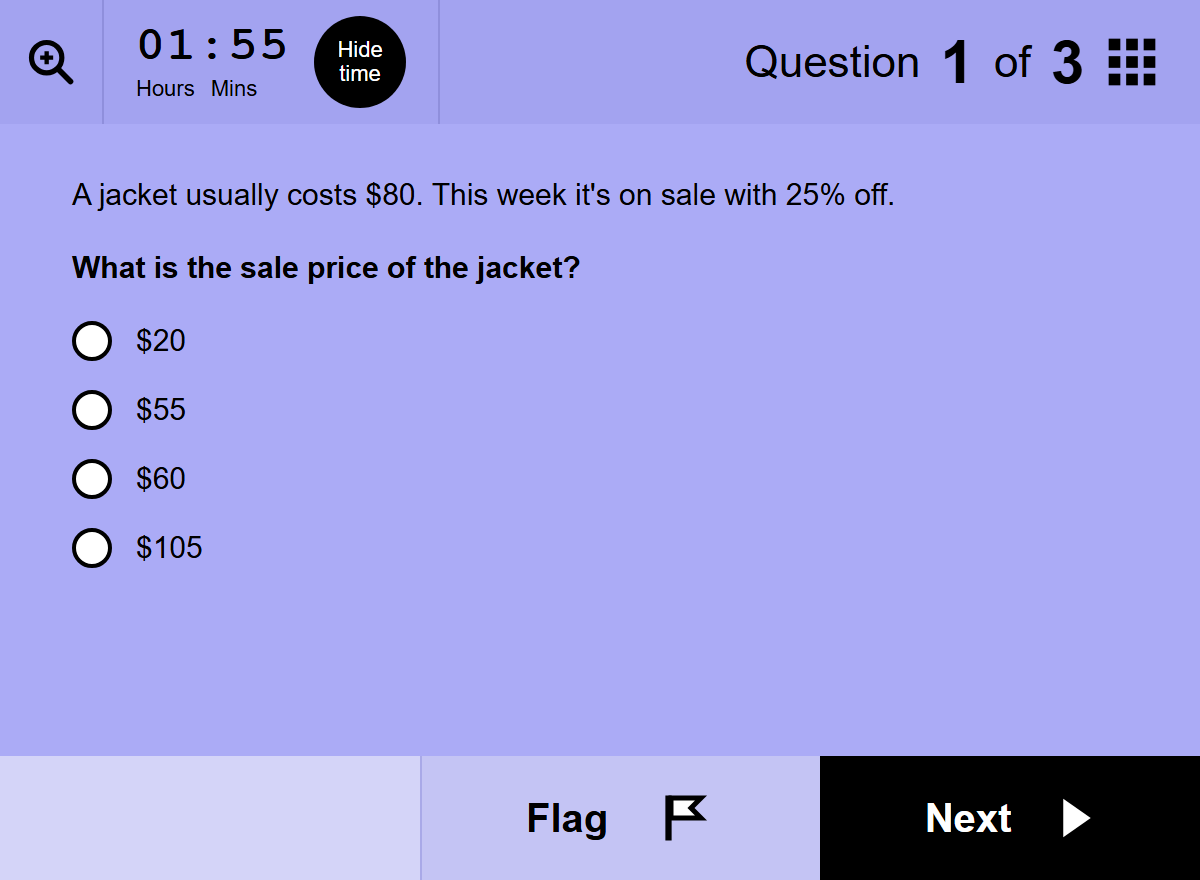
The example below gives Dev Patel black text on a lilac background, with a black Next button.
Choose a theme for a test
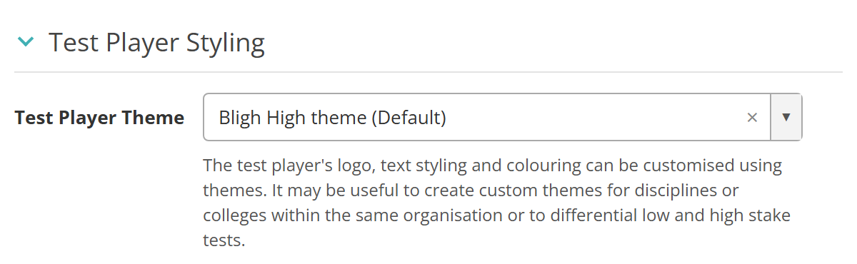
On the test's details page, expand Test Player Styling, select its pencil icon and choose a theme in Test Player Theme, then save. The list holds active themes only, with "(Default)" after the tenant's default theme. Leave it at None and the default theme applies.
The section appears once the tenant has at least one theme. A blueprinted test can't change its theme: it uses the theme set on its blueprint.
The rest of the section, from the equation editor to the player's title options, is covered in Create a test.
Settings
Administrators control who can work with themes at Settings > Roles. A role needs the test player theme permissions to create, edit and delete themes and to update each of the three sections. Choosing a theme for a test needs the test's save theme permission.
General Assessment Options (Settings > Test Designer Settings) — the personal needs and preferences linkage. Linking PNP codes at test attempt level adds the Default Test Player Theme field to every test-taker's user record.
The Default checkbox isn't offered when you manage themes at the Global level. A theme shared from Global appears in every tenant with "(Global)" after its name, and can be copied there but not edited.